Falling Light-years

Falling Lightyears, 22”x22”, acrylic on canvas, 2020.

Falling Lightyears, 22”x22”, acrylic on canvas, 2020.

Falling Light-years is a metaphor for the cosmic changing seasons of 2020. The world is no longer what it was a year ago. Everything is occurring at such a rapid pace it is almost overwhelming to witness. The days seem like falling years. What does a light-year look like and how can I paint it? The painting is a moment in this unprecedented time as I look for grounding and stability amidst chaos.


Inside Treetop Starsaver

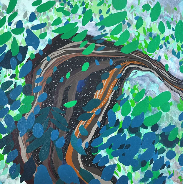
Treetop Starsaver, 24” x 24”, acrylic on canvas, 2020.

Treetop Starsaver, 24” x 24”, acrylic on canvas, 2020.

For Treetop Starsaver I imagined a device that could capture stars and glimmers of hope from above. The perspective is oriented from an aerial treetop view. I thought of the circular vessel of this composition in the same way as a bookshelf that holds it’s own cabinet of curiosity. I think of it as imaginary space to store expressions of gratitude. There is always a silver lining to find.


Behind Hydrothermal Eyes

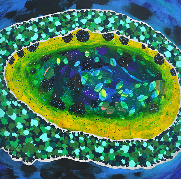
Hydrothermal Eyes, 16” x 20”, acrylic on panel, 2018.

The title points to geological features and human emotions and asks the viewer to consider the similarities between them. Hydrothermal-like ripples encircle kelp forests and bioluminescent organisms exhibit aquatic wonder in the painting. Layers of subjects like tracheid cells, species camouflage, and the cosmos also inspire the artwork.  Humans communicate extreme emotions with the eye in the same way as the hydrothermal temperatures exhibit extreme geological features.  The constellation of subjects reveals interrelationships and connections between the small to large in our world. I compose at macro and micro levels and the scale of the subject moves from aerial to microscopic.  I have a fascination in depicting these different scales and perspectives in the same composition.

I enjoy the potential metaphors in the hydrothermal hot spring features I saw at Yellowstone National Park. I chose this subject because of the depth of beauty in the colors but also the contrast that it is dangerous to humans to touch. The natural phenomenon of the heated water below the earth’s crust is an extreme environment in our world. There are trillions of microorganisms called extremophiles that make up the rings of vivid colors in these features. These creatures live within extreme conditions and are an unexpected metaphor. I like that it can be abstract on a first glance but also reference something that is somewhat recognizable. That mystery is compelling to create and explore in my paintings. The Burnt Umber webbing form in the lower right was inspired by looking at images of tracheids cells in plants. 


Recurring Motifs- Tracheids

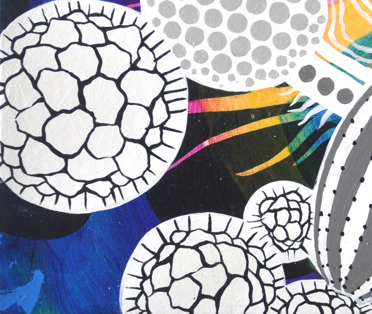
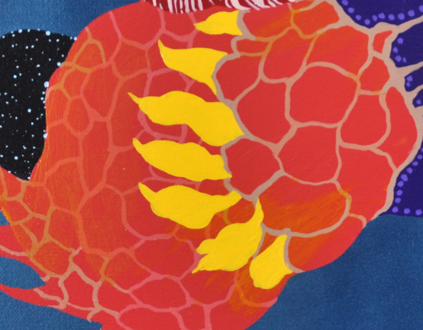
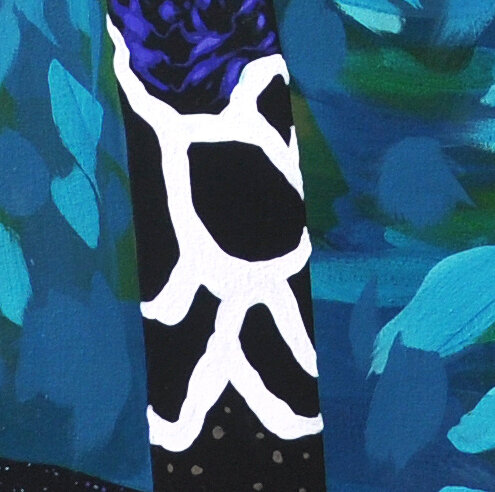
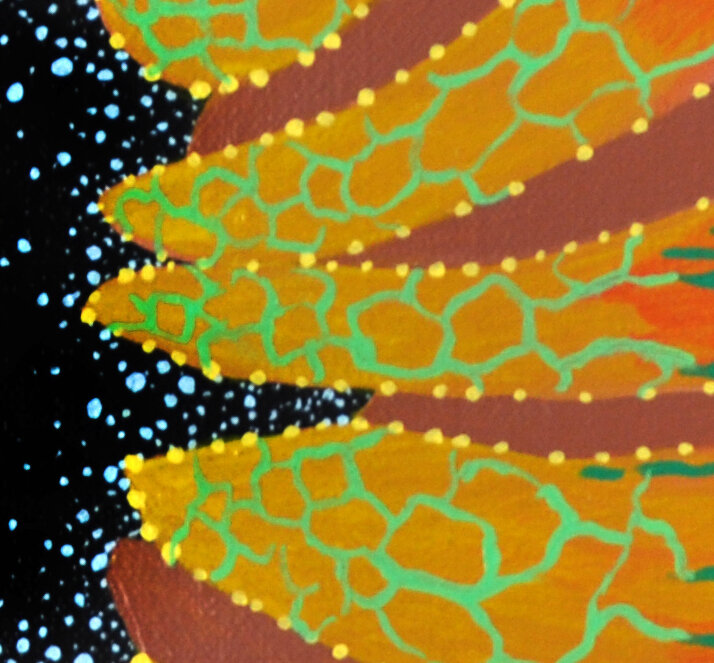
There are some patterns or motifs that I have been repeating in my work for as long as I can remember.  For example in Moon Pollinators the webbing pattern is repeated twice in this detail of the painting as a large structure in light ultramarine blue and then as a small pattern in light violet.   Looking at images of tracheid cells in plants originally inspired the motif and you can see it repeated in many of my paintings.  It has become part of my visual vocabulary as an artist.  Similar to the trachea in the human body, the tracheids transport and distribute important elements like water and salts to all the different parts of the plant.  It’s how the plants breathe and live.   At first, my heart responded with joy in viewing the tracheids intricate patterns and magnificent color variations. Next I was further drawn to its function as a vessel.  I find the subject of a vessel is rich with poetic metaphor and creates content or meaning in the painting.  The tracheid pattern draws attention to the subject and is further transformed through the process of painting.  I see this pattern in my work like a vessel that holds and transports our vital life essence and also creates a road map for experience as humans.


Thoughts on my color palette

IMG_7121.JPG

I wanted to describe the reasoning for how and why I choose the colors in my paintings.  It’s a very exciting and complex subject and one that I am very passionate about as a painter.   I often work with highly saturated colors and many of the details work uses various values within each color.  I have preferences for jewel tones and there is usually an abundance of deep blues in my work.  Working with these colors brings the most energy, joy, and wonder to my painting process.  There are color similarities and color stories for each series of work that I create.

While my work sources nature, I don’t use many neutrals or what most would consider natural colors of brown, green, and beige.  However, the colors I use are selections from unseen nature.  For example, images taken with microscopes or telescopes are often altered with staining or embellishing.   This practice enables the viewer to see and experience the images more clearly.  When selecting my color palette, I have these same ideas in mind.  Microscopic image alteration is not really standardized so you will see a lot of variation when comparing different source images of the same subject.  The microscope, camera, and even a printer produce a lot of variations of the same subject.  I often have scientific images around me in the studio while I’m working.  Since I’m doing so much inventing with shape, I really take a lot of liberty with color to use my own voice within the subject.  

Color is a way to adding my own content and emotion that is personal, poetic, and compelling.  The colors create candy colored vivid environments and fantastical dreamy elements that demand attention.  The colors do not sit idly by. I think of the colors create centerpieces or focal points. In visiting a garden or going on a walk, I am often drawn to the brightest flowers as they have a tendency to bring attention to themselves and delight my senses.  I select the colors in my palette in the same way as I experience color in nature.  Colorful flowers standout and have contrast from fields of green grass that they grow out of.  I’m drawn to the beauty in color but it’s also all of the magnificent variations that are possible. Color can convey emotions in how the light subtly changes while watching a sunset. Careful observations gives opportunities to slow down and appreciate what is around us.
A warm palette.

A warm palette.

I use a lot of aquatic colors like blues, magentas, and yellow-oranges that are often derived from thinking about coral reefs.  I like to imagine I’m there enjoying the visual theater in the depths of the ocean or in the shallow waters of a tide pool.   Watching the rainfall, looking forward to sunsets, thinking about memories of flowers are some of the subjects holding my attention lately.  Colors can have different temperatures that might be bluer or lean more towards yellow.  Temperature is an exciting technique to utilize in painting as it can create a rhythm in the mood of the composition.  What are the colors of twilight versus the colors of daylight?  They have a completely different feel and tone. I have been thinking about the temperature of 1970s photos, as they tend to have an overabundance of sun kissed golds and rusty oranges. The new LED lightbulbs have this intense blue light that is a bit garish on an environment like that in my neighbors new outdoor light that is almost blinding.

What about this idea of the psychedelic color or mesmerizing color combined with lines and shapes that compose rhythmic patterns?  Color can change our perception and alter our mood.  The color in our surroundings interacts with our internal psyche.  The colors of the pandemic might have certain characteristics as well.  What are pandemic colors?  It’s hard to think about that right now.  We’re in the dog days of summer now and the pandemic is far from over.  The colors are all around us.  II appreciate the subtle variations of colors and light even more during this isolation.

Hostas are blooming!

Hostas are blooming!

Thistles

Thistles